Seeing beyond 3-D

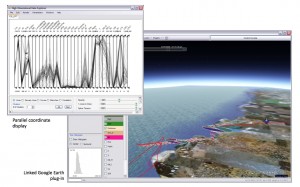
An analysis of aerosol particle and cloud compositions at various altitudes demonstrates the power of so-called n-dimensional computation, which gives researchers information about the role of aerosols on global and local climate change. The parallel coordinate display allows users to view and filter the composition of the particles and clouds; the linked Google Earth display enables a spatial co-reference. Users also may select any sample point or group of points along the flight path to view compositions in the parallel coordinate display. In addition, users may enlist pie charts to summarize the data at that location or area. The dataset was acquired by a single particle mass spectrometer (SPLAT II) on Flight 26 (F26) on April 19-20, 2008 as part of the Indirect and Semi-Direct Aerosol Campaign (ISDAC), a month-long field campaign at the North Slope of Alaska. (Click on image for larger, detailed view.)
To give audiences a better feel for life on a fictional planet, movie director James Cameron made the film Avatar in 3-D and moviegoers donned 3-D glasses. For scientists trying to get a better grasp on what drives climate on Earth, 3-D isn’t good enough. Instead, they’re turning to new techniques to help them see the details and interconnections that ultimately shape the big picture.
“I’m interested in high-dimensional visualization, which is an extension from 3-D visualization into n-dimensional visualization,” says Klaus Mueller, director of the visual analytics and imaging lab in the Center for Visual Computing at Stony Brook University. “Three dimensions is a somewhat solved problem in computer visualizations; n-dimensions is the new frontier. There are all kinds of problems in terms of the user interface and how to make people understand what it means.”
A traditional graph with an x-and-y axis is a two-dimensional visualization, showing the relationship between two variables, or dimensions. An n-dimensional visualization involves showing the relationships between four or more variables.
Mueller is collaborating with the Brookhaven National Lab-led FASTER (FAst-physics System TEstbed and Research) project to develop novel multi-dimensional visualization techniques and tools to help the FASTER researchers see how fine-level, fast physics processes, such as local aerosols and raindrops, shape global climate patterns.
For Mueller, the bigger question that connects all his research is how to effectively convey multi-dimensional information. He can’t give researchers the equivalent of n-dimensional glasses, so instead turns to how we see and interpret information.
We’re familiar with seeing four dimensions – 3-D plus time – and how to visually represent this – motion blur, for example, to show movement. Five dimensions and beyond, however, is a poorly explored territory in visualization yet one that’s crucial for dealing with complex simulations, such as climate. For example, in the FASTER models there are a dozen variables, or dimensions, that are linked to changes in atmospheric pressure.
One thing that’s clear: There’s a learning process in moving to n-dimensional viewing, Mueller says. With two-dimensional imaging sensors – our retinas – we’re able to see in 3-D. In fact, we teach ourselves to develop this fine-tuned spatial sense. When babies reach out to touch objects around them, they’re calibrating their depth and 3-D geometry perception.
“People are familiar with bar charts and pie charts and scatter plots for the display of two- and three-dimensional information,” says Mueller, who’s also an adjunct scientist with BNL’s Computational Science Center. “Anything else is a challenge for many people. This is the challenge for n-dimensional information visualization – to bring this to the masses.”
FASTER and better
The FASTER project is an ideal test bed for these new high-dimensional visualization tools, Mueller says. FASTER is itself an effort to explore how the computational modeling of rapid, small-scale fast physics processes, such as precipitation and cloud dynamics, fits into and shapes global climate models. It’s believed that errors in modeling these fast physics processes are responsible for major uncertainties in global climate model predictions.
“Virtually all of the fast-physics processes interact,” says Yangang Liu, the Brookhaven atmospheric scientist leading FASTER, “so once we get a handle on the individual processes, we want to see how they interact and how to evaluate these interactions. Data integration and visualization are an essential part of this analysis.”
Working with FASTER scientists and Stony Brook doctoral student Zhiyuan Zhang, Mueller has created a unique visualization system that links sophisticated multidimensional information displays with geographical context.


